

|

|
Slide 15 of 24


|

|
Slide 15 of 24
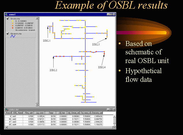
Shown above is an example of OSBL results in ArcView. The OSBL shown was drawn from the schematic of an actual OSBL unit. True dimensions were not available for the unit so "typical" values were used. Real input flow data was not available for the OSBL, so hypothetical values were used. Below the view of the OSBL unit is a table consisting of 4 lines. These lines indicate the hypothetical flow data used as input to the OSBL unit.
The results are shown by color in ranges of emissions values. Yellow indicates lower VOC emissions rates, while red indicates higher rates. This visual display allows for the immediate identification of "hot spots", or areas of concern due to high emissions.