Flow Networks and Basin
Precipitation
Prepared by David R. Maidment, Timothy
Whiteaker and Fernando Salas
GIS in Water Resources
Fall 2010
Computer and Data Requirements
Identifying Related Catchments
Goal
The goal of this exercise is to explore NHDPlus and especially its network capabilities, and also to plot a time distribution of precipitation over the basin and compare that with the time distribution of flow at the outlet.
Computer and Data Requirements
To
carry out this exercise, you need to have a computer, which runs the ArcInfo
version of ArcGIS version 10. You are going to get the data for this
exercise from ArcGIS.com rather than from a zip file as we have in previous
exercises. You will need to be connected
to the internet for this exercise.
Ex5.zip contains a geodatabase cut from NHDPlus Region 12, and in this exercise we are going to use the NHD Catchment information at a greater degree of detail than the Watershed Boundary Dataset that we used in Exercises 2. The NHDPlus is based on the National Hydrography Dataset Medium Resolution (1:100,000 scale), which was originally developed by the USGS. More information about the National Hydrography Dataset can be found at http://nhd.usgs.gov/. More information about NHDPlus can be found at http://www.horizon-systems.com/nhdplus/. USGS Streamflow Gages have been snapped to the network, allowing nearly seamless integration between NHDPlus and the National Water Information System (http://waterdata.usgs.gov/nwis/rt). The snapped USGS Streamflow Gages are available through the USGS at http://water.usgs.gov/GIS/dsdl/USGS_Streamgages-NHD_Locations_GEODB.zip.
Getting Data from ArcGIS.com
Open ArcMap 10 and
create a clear map display. Select Add Data from ArcGIS Online

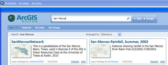
Type San
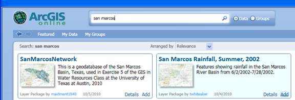
Marcos in the Search box and hit return.
You’ll see a couple of data sets presented to you as shown below. Select SanMarcosNetwork and Add it to your
map
When you add the data to your ArcMap display, you’ll see it appear as below
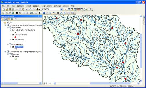
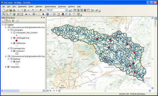
Right click on the Basin feature class and select Zoom
to Layer. Add a Basemap to provide some reference
information, use the Topographic basemap for this purpose.

And you’ll produce a nice map display of the
San Marcos basin with some background information for reference. Pretty cool!
Save your ArcMap file as Ex5.mxd.
Stream Network
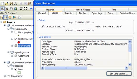
If you right click
on the NHDFlowline
feature class and go to Layer
Properties/Source you’ll see that the Feature
Type is Simple Edge which means
that this is a network feature class.
If you turn on the Hydrography_Net_Junctions and NHDFlowline
feature classes and turn off all the other layers, you’ll see the Edges and
Junctions that make up this geometric network.
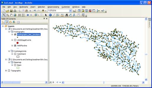
In Arc Map, right
click on the grey area to the right of the toobars
and select the Utility Network Analyst toolbar
to add to your display.
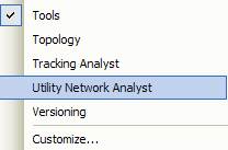
Use Flow/Display Arrows to symbolize your
flow directions.
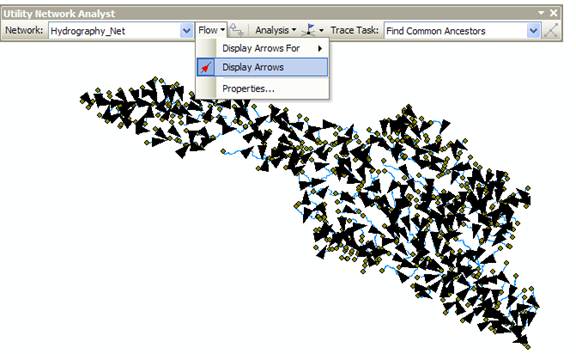
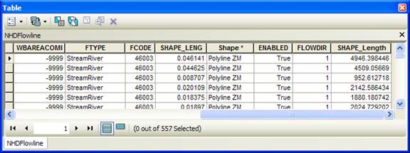
The NHDFlowLines have an attribute FlowDir that indicates what direction the flow proceeds on them. In this case, FlowDir
= 1 means that the flow direction is the same as the direction of digitization
of the lines in the NHDFlowline feature dataset. If you zoom in, you’ll see that all the
arrows point downstream.
Network Tracing
In the Utility Network Analyst toolbar, use Flow/Display Arrows again to toggle off
the flow direction arrows and also click off the display of the generic
junctions so you just leave the network itself displayed in Arc Map. Use the Utility
Network Analyst Add Edge Flag Tool to add an edge
flag near the outlet of the network.

And then select Trace Upstream to identify all the
upstream edges. Hit the ![]() symbol on the end of the toolbar to initiate
the trace.
symbol on the end of the toolbar to initiate
the trace.
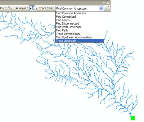
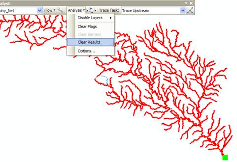
And Voila!! You get
this marvelously selected network. You
might see a couple of edges that are blue and not selected by the trace. Don’t
worry about that. Use Analysis/Clear
Results to get a clear network again.
If you use![]() ,
you’ll just get a “bong” noise that indicates that you have no disconnected
edges (if sound is turned on on your computer). Ok,
,
you’ll just get a “bong” noise that indicates that you have no disconnected
edges (if sound is turned on on your computer). Ok,
Use Analysis/Clear
Flags to get rid of the Flag
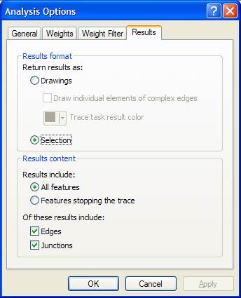
that you laid down, and then Analysis/Options to switch the Results from Drawings to Selection. This has the
effect of allowing us to actually select records with network traces, rather
than just see a red graphic network as we just did. Click Apply
and Ok, to close out this
window.
Identifying Related Catchments
Using the NHDFlowlines and Catchments feature classes we can find out which catchments are associated with a given USGS gage. To use this capability we first build a relationship between catchments and flowline feature classes. Save your ArcMap document as Ex5.mxd again.
Right click on the NHDFlowline feature class and select Joins and Relates/Relate
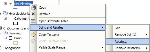
Use COMID as the relational field and Catchment as the related feature class, CatchmentHasFlowLine as the name of the relationship. There is one catchment for each flowline and they both have the same COMID in the NHDPlus dataset.
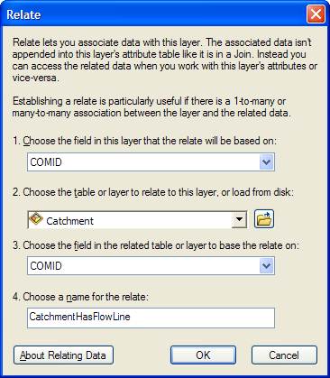
Save your ArcMap document Ex5.mxd to preserve the relationship that you’ve just created.
Lets
check out our relationship class. Zoom
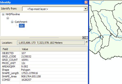
in to somewhere in the basin and click on a Catchment using the Identify tool![]() . You’ll see a window appear and by clicking on
the + signs on its left side you can identify which NHDFlowline
is related to this Catchment. In the
example given below, the COMID is 1628257 and it is the same on the NHDFlowline and on the Catchment that surrounds it. Pretty cool!!
. You’ll see a window appear and by clicking on
the + signs on its left side you can identify which NHDFlowline
is related to this Catchment. In the
example given below, the COMID is 1628257 and it is the same on the NHDFlowline and on the Catchment that surrounds it. Pretty cool!!
Now lets do a Trace Upstream to select a set of Flowlines. Zoom into the Blanco River at Wimberley, Tx. In the Utility Network Analyst Toolbar, Place an Edge Flag next to the USGS gage.
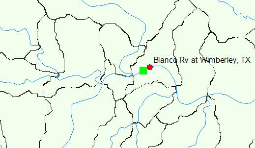
Trace upstream. Click the Solve button (Make sure that you have set Analysis/Options to Selection.)
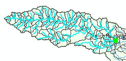
This gives you the selection of the flowlines flowing into the USGS gage. To find the catchments that are associated to the USGS gage we will now invoke our relationship class we created previously.
Right click the NHDFlowline feature class and open the attribute table. You can see the selected features. Click Related Tables. You will see the relationship we created shown as CatchmentHasFlowline. Click this relationship.
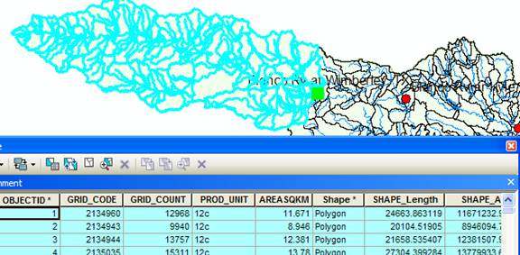
This opens the Attribute Table of the Catchment feature class. You can see that the Catchments related to the selected flowlines are automatically selected. Its likely that you’ll see if you examine it closely that there are slightly more streams than catchments in this selection. That’s because there are some fragmentary very short streams in the NHDPlus dataset. Don’t worry about that.
Using this table we can now find the number and the area of the catchments associated with any USGS gage. In the USGSGageEvents feature class the Drainage Area in Square Miles of the watershed upstream of the gage is given by the attribute DA_SQ_Mile. (1 square kilometer = 0.386102 square mile).
To be turned in: Make
a screen capture of the related catchments and flowlines
to the USGS gage near the Blanco River at Wimberley. Find the number and the
total area of the catchments associated with gaging station. What percent of
the total
Longest Flowpath
Use Selection/Clear Selected Features in
the ArcMap toolbar to clear all the selections you
made in the last section. Use Analysis/Clear Flags in the Network
Utility Analyst Toolbar to clear the Edge Flag you’ve been using.
Zoom into the top of
the network, place an edge flag
there and execute a TraceDownstream
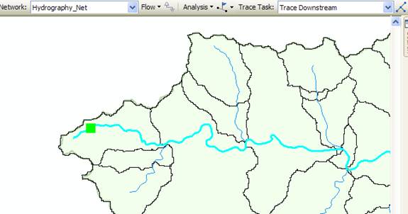
And if you zoom back
to the extent of the layer, open its attribute table and hit Selected for the
records, you’ll see that 93 of the 557 flowlines in
the network have been selected by this process. Hit the Show
Selected Records  to highlight the selected features.
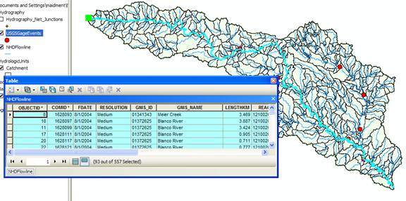
If you move along to
the LengthKm
attribute, right click on the field and select Statistics. You can get a table of statistics of the
selected records, from which you can find the average line length in km and the
total length along the flow path that you’ll need shortly.

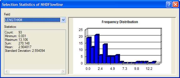
Save again your ArcMap display as Ex5.mxd
so you can come back and get this information if you need it later.
To be turned in: What is the total flow
length from top to bottom of the
Base Flow Index
Open the attribute table of the USGSGagEvent feature class. One of the fields present is called BFI_Ave. This refers to the average Annual Base Flow Index (BFI). BFI refers to the percentage of the flow which is Base flow i.e. that part of the stream discharge that is not attributable to direct runoff from precipitation or melting snow; it is usually sustained by groundwater. The Base Flow Index (BFI) is used as a measure of the base flow characteristics of catchments. It provides a systematic way of assessing the proportion of base flow in the total runoff of a catchment.1 Let’s try and explore it further. We will symbolize the Basin using BFI on the gaging stations. Right click the USGSGagEvents feature class and go to properties. Under the Symbology tab go to Quantities and pick graduated symbols. In values select BFI_Ave from the drop down menu.
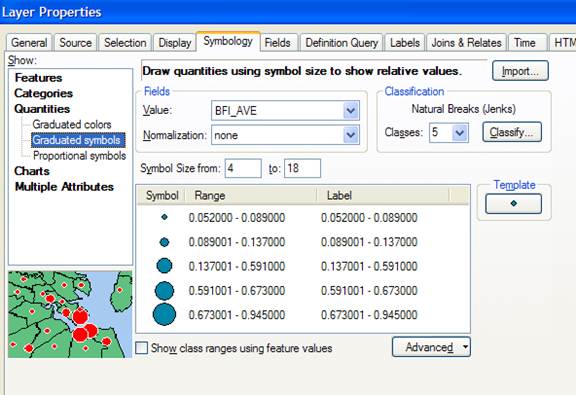
Click OK. Go to Properties/Labels and set the Label Field to be BFI_Ave Right click on the USGSGageEvents feature class and Label Features You can produce a display like the one shown below. Increase the Font size so that you can read the values clearly.
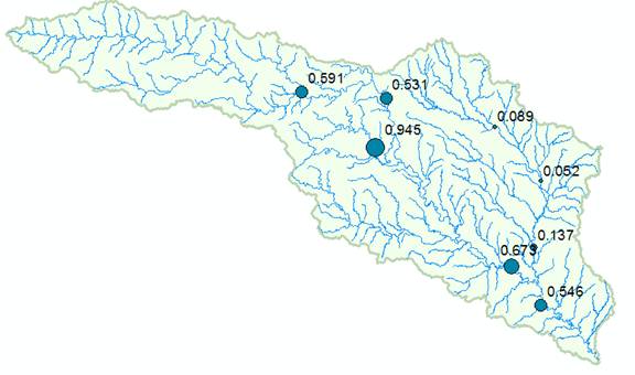
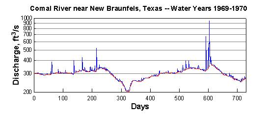
This shows that at some gages 95% of the flow is Base Flow while at other locations only 5% is base flow. For more information on how to determine base flow, see http://www.usbr.gov/pmts/hydraulics_lab/twahl/bfi/ from which the following picture has been extracted. Base flow is the flow beneath the red line in this graph and surface runoff is the excess flow defined by the difference between the blue line and the red line.
Why should there be so much variation in the base flow in
the
The mean annual flow in (cfs) at each gage is given by the attribute AVE in the USGSGageEvents feature class.

If you similarly symbolize and label the map using AVE, you’ll get a result like this:

At any gage location, the product of BFI_Ave * AVE gives the mean annual base flow in cfs. For example, at the Blanco River at Wimberley, the mean annual base flow is 0.591 * 142.183 = 84.03 cfs.
To be turned in: Make
a screen capture of the BFI_Ave points displayed on
the basin streams and basin outline as background. Make a table of the 7 stream gages that shows
the drainage area and mean annual base flow for each gage. Comment on the values in this table. Are they consistent?
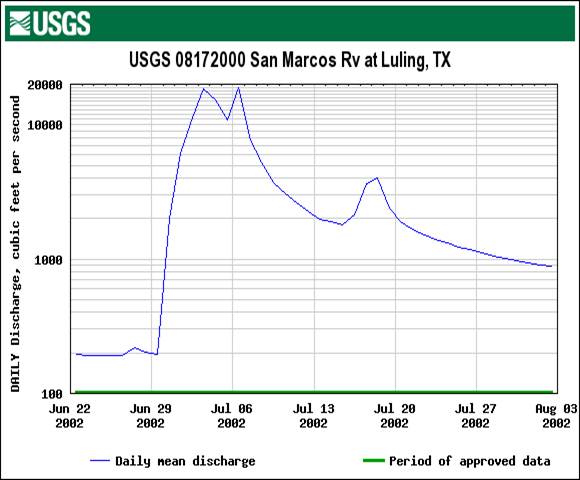
We are going to create a time series of precipitation for a storm over the San Marcos basin that created a big flood in July of 2002. Here is a graph from the USGS NWIS site of the flow during this period of the San Marcos River at Luling. You’ll see that there is a main peak in the flood flows in early July and then a secondary peak about July 18 after more rain fell.
Lets go
back and get some more data from ArcGIS Online.

Search again for data about San Marcos, choose to Add the San Marcos Rainfall, Summer, 2002.
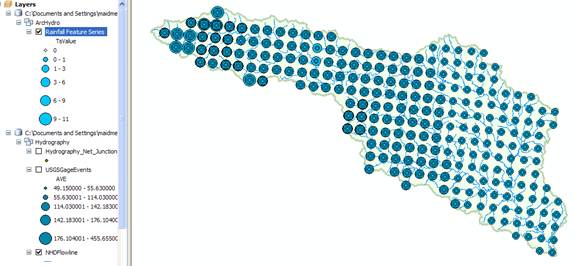
The data that are added, called Rainfall Feature Series are a Time-Enabled Feature Layer in ArcGIS 10.
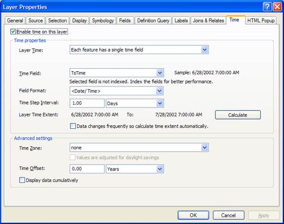
Time-Enabled Feature Layers are a pretty important innovation that is new in ArcGIS version 10, so lets take a look at what this means. If you right click on the Rainfall Feature Series layer and open its Properties, you’ll see a Time tab that is new in ArcGIS 10. As shown below, it identifies a field, called TsTime that defines the time field of these data and specifies that these data are regularly measured with an interval of 1 day.
If you open the attribute table of this layer, you’ll see the following. This is an Arc Hydro II time series table which has been joined onto the features that its time values describe. In this case, they are Nexrad radar rainfall multisensor precipitation obtained from a WaterML web service hosted by the University of Texas at Arlington (Dr John McEnery) using precipitation data provided by the National Weather Service’s West Gulf River Forecast Center in Fort Worth. The rainfall data were obtained using HydroDesktop and converted to an ArcGIS feature layer with a ModelBuilder script developed by Tim Whiteaker and Fernando Salas.

There is a rainfall value (TsValue) for each Nexrad cell (FeatureID) and time step (TsTime). In other words, each record in the attribute table represents a unique point in space and time, not just in space as we have used before.
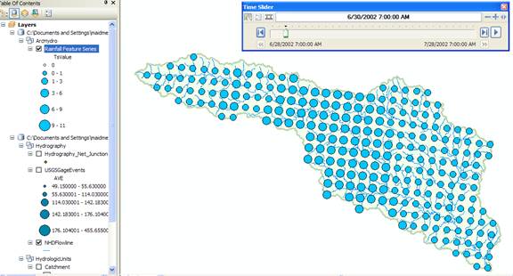
To visualize these data as
they evolve through time, open the Time
Slider window:

And cycle through the daily rainfall maps in this storm. This was a serious flood! There is heavy rain throughout the basin on June 30.
Open ArcToolbox
![]() and select the Summary Statistics tool
and select the Summary Statistics tool
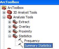
Select Rainfall Feature Series as the Input Table, TsValue as the Statistics Field, MEAN as the Statistic Type, and TsTime as the Case Field.
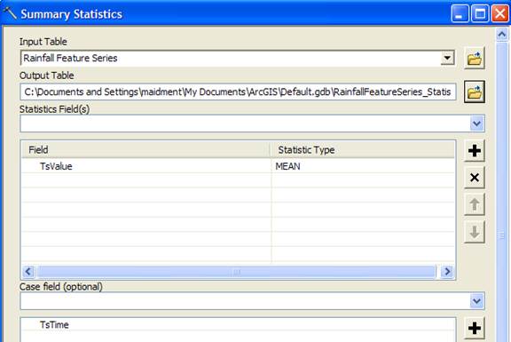
Wait a couple of minutes for this computation to complete. This produces a statistics table that specifies the basin average rainfall for each day of the storm.
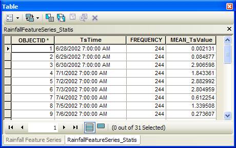
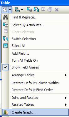
Create a graph of these data.
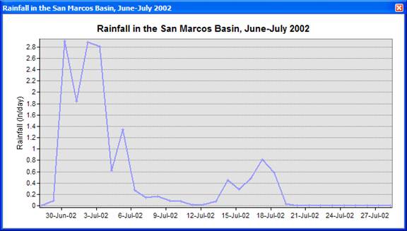
To be turned in: Make a layout
combining a map of the rainfall distribution for June 30 with a graph of the
distribution of rainfall through time averaged over the basin. What is the maximum rainfall daily amount in any Nexrad cell at any time during the storm? Where does it occur? What is total average
rainfall over the San Marcos basin from 28 June to 28 July 2002? What is the total average rainfall over the
basin from 30 June through July 6?
Summary of items to be turned in:
(1) Make
a screen capture of the related catchments and flowlines
to the USGS gage near the Blanco River at Wimberley. Find the number and the
total area of the catchments associated with gaging station. What percent of
the total
(2) What is the total flow length from top to
bottom of the San Marcos Basin (km). What is the average length of the 93 NHDFlowlines on this flow path (km).
(3) Make a screen
capture of the BFI_Ave points displayed on the basin
streams and basin outline as background.
Make a table of the 7 stream gages that shows the drainage area and mean
annual base flow for each gage. Comment
on the values in this table. Are they
consistent?
(4) Make a layout
combining a map of the rainfall distribution for June 30 with a graph of the
distribution of rainfall through time averaged over the basin. What is the maximum rainfall daily amount in any Nexrad cell at any time during the storm? Where does it occur? What is total average
rainfall over the San Marcos basin from 28 June to 28 July 2002? What is the total average rainfall over the
basin from 30 June through July 6?